
Documentation
The dashboard
Tiles, gauges, charts and the map: building a screen around the way you ride.
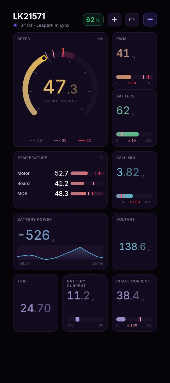
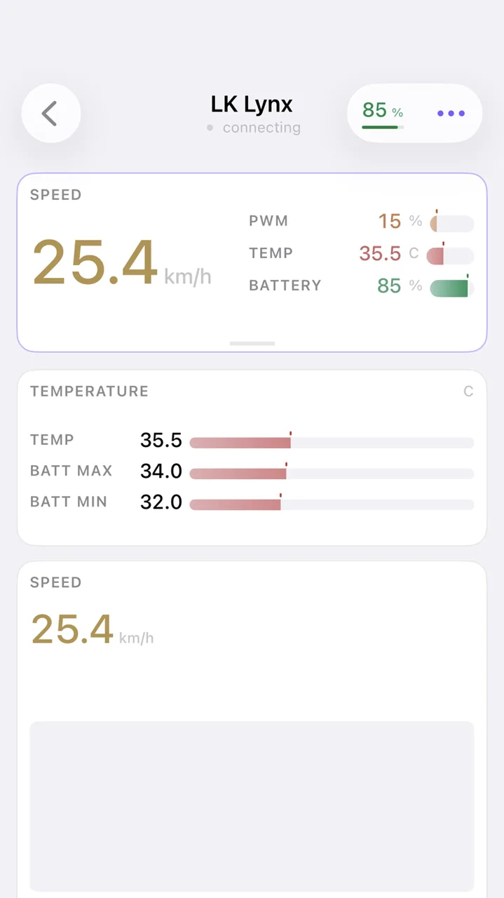
The main screen is a grid of tiles. Each tile shows one reading. Which tiles are there, how big they are and in what order is up to you, and the arrangement is saved per wheel.
While the app is open the phone's screen stays awake: an instrument is looked at, not touched, and the system timeout used to dim the display exactly when the readings were needed. Send the app to the background and the phone sleeps as usual.
Rearranging it#
- The plus button at the top adds a tile. The list only offers readings your wheel actually reports.
- A tile can be dragged to a new position and resized by its corner.
- A tile you do not want can be removed.
Some models start from a layout picked for them. An InMotion P6, for example, shows tyre pressure straight away, because that wheel reports it.
What can be shown#
The list depends on the brand and model. Everything the app knows how to display:
| Group | Readings |
|---|---|
| Motion | speed, trip distance, total distance, ride time, moving average speed, acceleration |
| Load | PWM, output current, phase current, battery power, apparent power, motor power, torque, current limit |
| Battery | charge level, voltage, battery current, left and right battery currents, lowest, highest and average cell, cell spread, watt-hours per kilometre |
| Temperatures | controller, motor, board, CPU, IMU, battery, hottest cell, hottest battery board |
| Attitude | pitch angle, roll angle, target angle, pedal angle, acceleration and braking angle, fall angle |
| Wheel limits | tilt-back speed, speed warning, tilt-back by PWM, PWM warning, tilt-back by bus current, danger speed, stop speed |
| Charger | whether it is charging, charge voltage and current, charge power, charger temperature, amp-hours and watt-hours delivered, target voltage |
| Other | ride mode, lock state, charge mode, shutdown timer, tyre pressure, remaining range |
| Estimated by the app | predicted charge, predicted range |
The list is the same on Android and on iPhone: one catalogue in the shared core drives both, and a reading missing on one platform fails to build on the other. Before the 18 August 2026 release the iPhone showed only part of the set — the engines decoded the rest, but the app never lifted it onto the screen; now it does.
If a reading is missing from the add menu, either your wheel does not report it or that part of the protocol has not been decoded yet.
Predicted charge and predicted range#
These two the app works out itself rather than reading off the wheel.
The charge a wheel reports is usually derived from voltage, and voltage sags under load. On a 36S pack with about 180 mOhm of internal resistance, fifty amps cost eight volts, so the number dives when you accelerate and recovers at the lights. On real rides the reading swung by 20-44% over rides that actually used 9-16%.
Predicted charge takes the sag out: the app measures your pack's internal resistance from your own riding and works out what the voltage would be with no load. It then cross-checks that against how many watt-hours actually left the pack, and each corrects the other.
Predicted range is the remaining charge divided by your consumption per kilometre, adjusted for how you are riding right now - speed and how ragged it is cost about the same.
Turning percent into kilometres needs the pack's capacity in watt-hours, and nothing reports it. For models the app knows it comes from a built-in catalogue, and from there your own pack's curve - built from your own rides - refines it.
The catalogue holds the nameplate capacity - what the maker claims for a new pack. Yours may hold noticeably less: age, winter, kilometres. So the app treats the nameplate as a starting point and walks the capacity toward what your own rides show. If the range estimate settles below the number on the box, that is a measurement, not a fault.
For a model the catalogue does not list, capacity is worked out from how many watt-hours went into each percent of drop, so it takes a while to appear. Until there is something to work it out from the range stays blank: half the truth is worse than none - range is what you plan the way home on.
Both sit alongside the factory numbers and replace nothing: "Battery" and "Remaining range" stay exactly as the wheel reports them. You have to add the tiles yourself - your screen will not change on its own.
Zero on this scale is 2.95 V per cell: that is as low as a modern wheel discharges safely, and it is what Veteran's low battery mode uses (106.2 V on a 36S pack). The pack's energy does not depend on a setting, so the pedal-tiltback threshold does not move zero - it cuts the bottom off. With the mode off the wheel stops holding you up at 113.4 V, and everything below that the scale marks unavailable. At the same voltage the mode being on shows more charge left: not a different pack, a different permission on the same one.
Train on past rides. The "Battery model" section has a "Train on past rides" button: the app walks the rides you have already recorded and builds this pack's curve from them, instead of waiting for you to ride new ones. It shows the list first - which rides it can learn from, how many kilometres that is, and why the rest did not qualify. Three kinds are left out: rides recorded by an older version, where braking was logged as spending; rides where the current sign never appears; and rides too short to say anything. Merged rides are cut at their seams - a charge may have happened between the parts - and telemetry from a standstill is skipped entirely: voltage recovers there, charge does not.
The trained model travels with your rides: it goes into the export and comes back on import on another phone. Moving used to lose everything the app had learned.
Accuracy grows with mileage. On the first rides the app knows little about your pack and falls back on a generic curve measured off a three-hour 36S charge - 1939 Wh, both ends taken at rest; the more you ride, the better it knows your pack in particular. A stretch of charge you have never ridden through is a stretch the app has never seen, so deep discharge only gets accurate after you have been there at least once.
None of this leaves the phone: your pack's model lives on the device, in the same database as your rides, and travels with their export.
When a charger is connected#
A charger is not a wheel, and its list of readings is its own: it has no speed, no PWM and no battery pack, so the add menu offers only the "Charger" row from the table above. The tiles are named after its own sensors — "Charge power" rather than "Battery power", "Charger temperature" rather than "Controller temperature".
The set also depends on the charger model: SKAT reports a target voltage, the HW Smart Charger has no such reading, and it will not appear in its add menu.
Multiple dashboards#
You can set up to six dashboard layouts for each wheel — for example, city, speed and diagnostics. Dashboards are switched with a horizontal swipe across the dashboard; a strip under the header shows which dashboard is open and how many there are, and when you switch, a dashboard's name pops up briefly. The easiest way to create a second one is to swipe while you have one — the app offers to add it. Management is through a tap on the strip or the dashboard menu item "Dashboards": create a copy of the current one, rename, delete.
Pinned band side metrics can now be reordered — in the band settings, drag a row by the handle on the left.
The pinned band#
The band above the grid stays put while the grid scrolls, so the reading you watch for the whole
ride never leaves the screen. Turn it on from the ☰ menu → "Pinned band", and set it up there:
- a lead reading, drawn as large text, a speedometer or a scale;
- up to three side readings, each with its own margin scale;
- three heights, which the band itself also switches — drag the handle at its bottom edge.
The first row of its settings is a list of the metrics already in the band: colour, form and thresholds are edited on the metric screen, and you no longer have to hunt for the same metric in the grid.
The band is remembered per wheel, the same way the tile layout is.
Appearance#
Menu ☰ → "Appearance". Theme, accent, app background and tile background are chosen
separately, with a preview at the top that shows what you are getting.
Two of the controls there are about tiles:
- Tile border. The theme's thin line by default. Next to it are six palette colours for a quick pick and a custom colour you choose in full. The pinned band takes the same colour — it is the first card of the same screen. A breached threshold never gives its colour up: that border reports state, not appearance, and stays the colour of the severity.
- Chart bed. It can be turned off — the curve then lies straight on the tile, with no well under it. Scales are untouched: on a scale the bed means "this is how far it did not get", and without it the fill stops being a mark.
Dashboard presets#
A dashboard you have built can travel: to your second wheel, or to another rider. The ☰ menu →
"Dashboard presets". A preset carries which tiles there are, their sizes, order, look and colours,
the metrics inside cluster tiles and the pinned band setup, plus the app's accent and backgrounds.
Alerts and general settings are not part of it.
One preset, four ways to hand it over:
- a link — "Share" sends it through any messenger; opened on a phone with LoEUC, it drops the preset into the library. The link is short: the preset itself lives on loeuc.ru and the link carries only a code. With no network the app quietly hands you the long self-contained link instead — it carries the whole preset, puts nothing on any server and works just the same (see the privacy policy);
- the clipboard — "Copy link" on one side, "Paste from clipboard" on the other;
- a QR code — show it on your screen and point the other phone's ordinary camera at it; no scanner of our own is involved;
- a file — "Save all to a file" writes the whole library at once, which doubles as the way to carry it to a new phone.
The dashboard catalogue#
Separately from handing a preset to one person, you can put it on the public catalogue — the "To catalogue" button in the same library. Sharing and publishing are two different decisions: a short link goes to whoever you sent it to, the catalogue is seen by everyone.
The catalogue holds one card per dashboard. "The same dashboard" means the same arrangement: the same tiles in the same places, at the same sizes and in the same modes, with the same metrics inside cluster tiles and the same pinned band. Colours, themes and names do not count, so a recoloured copy does not become a second card: if that dashboard is already published by you, the new publication takes the old one's place; if by somebody else, the app tells you it is already there and nothing is added.
None of this touches links. The preset is unchanged, its link keeps working, and it can still be handed over and applied whatever the catalogue decides to list.
What happens on a different wheel#
Wheels report different telemetry, so a preset applies partially — but honestly. Before anything changes, the app shows a report in three parts:
- land as they are — the readings every wheel has: speed, voltage, PWM, power, controller temperature, battery level, distances;
- take the same slot under their own name — your wheel has no such sensor but has a close one. The tile keeps its position, size, look and colour, but it names the sensor it actually reads. MOSFET temperature from a LeaperKim becomes controller temperature on a Begode, and says so;
- dropped — no reading and no close match. The tile does not appear and the grid closes up.
Angles and currents are only replaced within one brand. Every brand puts its own zero on the pitch angle and calibrates its own gyroscope, and phase current runs several times higher than output current by an amount that depends on how the brand counts it. Across brands such a substitution would print a plausible but wrong number, so the reading is dropped instead. Roll is never substituted at all — that is a different axis.
How a tile looks#
You choose how each tile draws itself. Tapping a tile opens that reading's own screen, and the "Tile" button there opens the tile itself: its size, its look and its colour:
- a chart, which is the default;
- a speedometer — an arc with the thresholds on it and an "avg · max" line below;
- a horizontal scale;
- a vertical scale;
- a bipolar scale, for readings that go negative: current and power under braking;
- large text.
A tile's chart scales by its own rule, and it does not follow the last few minutes. The window always covers the whole span of the ride, and where the reading has an alert, it also clears that limit by a tenth above it. The limit line therefore sits inside the chart instead of being pinned to its edge, and the same curve height means the same thing at the start of a ride and at its end. When the ride went higher than the limit, the window follows the ride: what already happened does not drop off the picture.
A bipolar scale carries a caret on each side of zero: acceleration and regeneration for current, acceleration and braking for the rate of change. The second one appears only if the ride actually crossed zero.
Besides your thresholds, a scale also marks the peak of the ride as a short notch in its own colour. For readings that only fall over a ride — charge, voltage, cells, range left — the notch marks the sag instead of the top: their maximum is the state at the start, known in advance.
The ride's min and max are printed under the scale wherever there is room for them: in the pinned band at heights M and L, and in a tile from the size where the row still has height for numbers. Each number stands under its own point on the scale rather than at its end — so the meaningful one lands right below the peak notch and labels it. When the two points crowd together, or only one number fits, the meaningful edge stays: the sag for falling readings, the peak for rising ones.
A vertical scale does the same thing sideways: the peak's number sits opposite its notch. It yields both to the ends of the scale and to the threshold mark — if it lands at their height it is not printed at all, because the threshold cannot be read off the rail itself, while the peak is already visible as a notch.
One tile shows the map on the main screen, if route recording is on. Its corner carries the same buttons as the full map: "+", "−" and "fit track". The tile never moves the camera during a ride — the route grows, the map stays where your hand left it.
Several readings in one tile#
Related readings — three temperatures, the battery currents, the cells — can share a single tile. The tile's own screen is where they are added; how many fit is worked out from the tile's size and look, and the list only offers the ones that still do. A unit shared by all of them moves into the tile's header instead of repeating on every row.
Those rows are drawn as bars, as charts or as columns, chosen where any other tile's look is.
A reading's own screen#
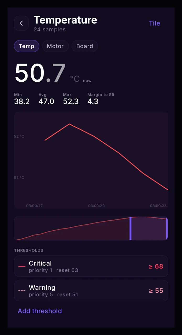
Tapping a tile opens the reading in full: the value now, the minimum, average and maximum of the ride, the margin to the nearest threshold, and a chart you can run a cursor along. Below it is the list of that reading's thresholds — each one leads into its alert, and "Add threshold" opens a new alert with the reading already filled in.
Quick actions#
Below the grid sits a row of quick actions. What appears there depends on the wheel:
- low beam,
- high beam,
- automatic light,
- power off.
The set is decided by brand and model, because the commands differ between wheels.
Automatic light#
The light comes on by itself once the wheel goes faster than a threshold you set. There are three ways to turn it back off, and exactly one is in effect:
- by speed — you drop below the threshold and the light goes off;
- by inactivity — the wheel has been standing still longer than the delay;
- by pedal angle — the pedals tilt past the threshold, 45° by default.
The third one differs from the other two in that it watches the wheel's pose rather than its motion. Picked up by the handle, laid on its side, put on its stand — the pedals go far past any riding tilt and the light goes off. Speed and timers are no help there: a wheel carried in your hand sways, and every sway restarts the inactivity delay.
The angle counts by absolute value, so tilting forwards and backwards work the same. Roll is ignored: that is a turn, and a turn is where the light is needed most.
Not every wheel reports a pedal angle — LeaperKim and Inmotion do. On the rest the option is unavailable, which is more honest than offering a mode that could never fire. And if a wheel reports no angle while the mode is somehow selected, the light stays on: turning it off blind is worse than not turning it off.
Session summary#
A separate row sums up the current session: top speed, average speed, peak PWM, battery used, distance and duration. It is the quickest way to compare two climbs or two launches without opening the ride history.
Reset peaks#
"Reset peaks" in the header menu clears the session maxima: the peak markers on the instruments and any scale stretched to fit a record go back to their usual values. Ride history is left alone — the recording still holds everything that actually happened. This helps when one ride is really several: you ride to the spot, and what you came for starts there, and you want to measure it from a clean slate.
Speed correction#
If the readings disagree with another instrument, Settings, Speed & accuracy has a speed correction. It is a percentage: a hundred means no change, a hundred and ten means show ten percent more. The correction changes only what you see and never touches the wheel.
The correction is remembered per wheel. Odometry differs between wheels, and one value for the whole app would be wrong for both.
Speed scale maximum#
By default the app picks the speedometer ceiling itself, from battery voltage, and stretches the scale if you go faster than it. If that gets in the way, set your own maximum next to the speed correction. A ceiling you set is firm: the scale no longer stretches, and on a record the needle stops at the edge. That is the point — the needle's position always means the same thing.
The maximum is remembered per wheel too.
GPS speed#
With GPS recording on, you can put a "GPS speed" reading on the dashboard. It comes from the phone's receiver rather than from the wheel, and the speed correction is not applied to it.
When the signal goes — a tunnel, a bridge, a street of tall buildings — the reading goes blank instead of freezing at its last value. A frozen speed is more dangerous than a missing one, which is also why an alert built on it stops firing at that moment.
GPS speed calibration#
The app can work out how far off your wheel's speed reading is. It compares wheel speed against GPS speed, but only at a steady pace: acceleration and braking are left out, because the receiver answers with a lag and gets them wrong by more than the correction being looked for. A weak signal, standing still and suspicious position jumps are dropped as well.
No suggestion appears until at least three rides and ten minutes of usable data have gone by, and until the spread of the measurements is narrow enough. Once it does, a card under Speed & accuracy offers the new value and shows what it rests on: how many rides, how many minutes and what spread. The spread is always shown — it is what tells you whether to trust the number.
You apply the correction, not the app. That is deliberate: where GPS is spoofed, an automatic change would quietly corrupt both your readings and your alerts. If you do not like the suggestion, tap "Not now" and the app will not come back to it until it has gathered noticeably more data.